In this tutorial, let us first begin by understanding the basics using the plot() function in R. The R language is well known for its beautiful graphics with a rich set of functions to build and format any kind of graphs and the plot() function family is one that helps us build those.
The plot() function in R isn’t a single defined function but a placeholder for a family of related functions. The exact function being called will depend upon the parameters used. At its simplest, the plot() function simply plots two vectors against each other.
plot(c(1,2,3,4,5),c(1,4,9,16,25))This gives a simple plot for y = x^2.
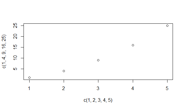
Square plot in R
Changing Graph Appearance with the plot() function in R
The plot() function in R can be customized in multiple ways to create more complex and eye-catching plots as we will see.
- The shape of the markers: The plot markers are by default small, empty circles. These are also known as plot characters - denoted by pch. You can change these by adding a new pch value in the plot function. Pch values 0 to 25 are valid and give several different symbols on the graph. Pch 0 is for a square, 1 is for a circle, 3 is for a triangle, 4 is for a cross and so on.
- Size of the plot markers: This aspect of a graph can be controlled using the cex parameter. The cex parameter can be set to 0.5 if you want the markers to be 50% smaller and 1.5 if you want them to be 50% larger.
- Color of the plot markers: The symbols can be assigned one or many colors. These colors can be selected from a list provided by R under the colors() function.
- Connecting the points with lines: Many times, it is necessary to connect the displayed points with different kinds of lines. This can be done using the type attribute of the plot function. The type attribute set to ‘p’ refers to only points and ‘l’ to only a line. Similarly, values ‘b’ and ‘o’ are for lines connecting points and overlaying points respectively. To get a histogram like display the ‘h’ option is used and ‘s’ is used for a step option.
- Varying the lines: The line type can be specified by the lty parameter (range 0 to 6) and line width is set using an lwd parameter.
Let us now try constructing a few graphs with what we learned so far.
We will begin by generating a sine wave plot. Let x be a sequence vector of values from -pi to pi with 0.1 intervals and y contains the respective sine values of x. Now try plotting y against x.
x=seq(-pi,pi,0.1)
y=sin(x)
plot(x,y)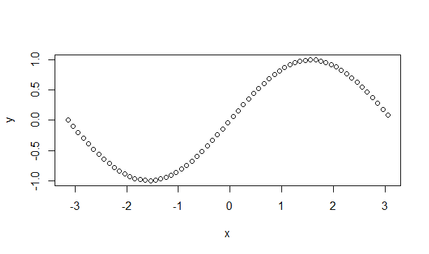
Sine wave
Let us now try changing the symbols and colors.
plot(x,y,pch=c(4,5,6),col=c('red','blue','violet','green'))We are now enabling the compiler to select from 3 different symbols and 4 different colors for marking the graph. Let us see how it turned out.
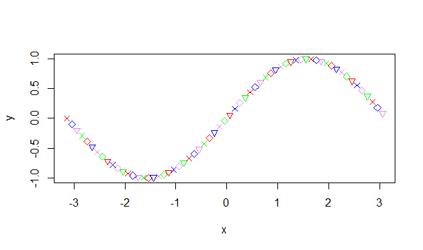
Colorful Sinewave
R also allows combining multiple graphs into a single image for our viewing convenience using the par() function. We only need to set the space before calling the plot function in our graph.
#Set a plotting window with one row and two columns.
par(mfrow=c(1,2))
plot(x,y,type='l')
plot(x,y,pch=c(4,5,6),col=c('red','blue','violet','green'))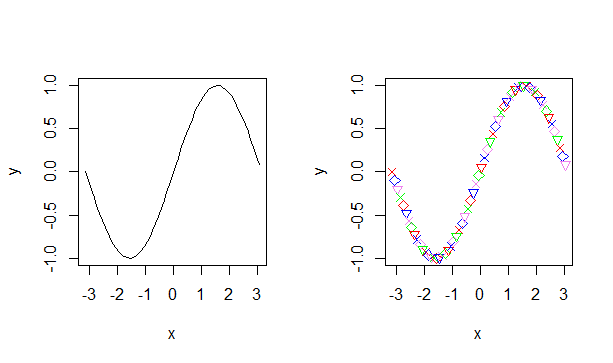
Combining Plots In R
A few more graphs using various options from above are illustrated below.
#Set space for 2 rows and 3 columns.
par(mfrow=c(2,3))

#Plot out the graphs using various options.
plot(x,cos(x),col=c('blue','orange'),type='o',pch=19,lwd=2,cex=1.5)

plot(x,x*2,col='red',type='l')

plot(x,x^2/3+4.2, col='violet',type='o',lwd=2,lty=1)

plot(c(1,3,5,7,9,11),c(2,7,5,10,8,10),type='o',lty=3,col='pink',lwd=4)

plot(x<-seq(1,10,0.5),50*x/(x+2),col=c('green','dark green'),type='h')

plot(x,log(x),col='orange',type='s')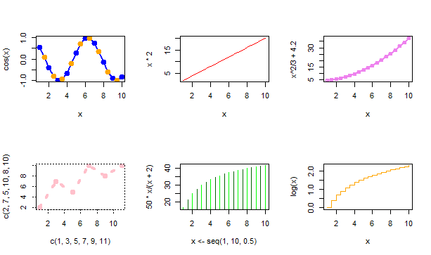
Multiple Plots In R
Matching infrastructure at centron
Scripts and services eventually need an environment that keeps running: ccloud³ VMs from €3.12 per month, billed by the hour. Rent a cloud server →
Adding More Information to Graphs with plot() Function in R
Graphs look more complete when there are notes and information that explain them. These include a title for the chart and axes, a legend of the graph. Sometimes even labeling the data points will be necessary. Let us look at how we add these to the graphs in R.
- The main title is added using the main option in the plot function. The font, color, and size can be customized using the font.main, col.main and cex.main respectively.
- The titles for the axes are provided using xlab and ylab attributes. These can be customized using font.lab, col.lab and cex.lab like above.
- You can also add some extra text inside the plot using the text attribute, specifying the text to use and the coordinates to display.
- The text attribute can also be used to label the data points. The text, in this case, is a vector of labels instead of a string.
- The legend can be added to a graph using the R’s legend() function. Legend takes as input the coordinates, text and the symbols to be interpreted.
Let us look at examples illustrating these.
#Displaying the title with color
plot(c(1,3,5,7,9,11),c(2,7,5,10,8,10),type='o',lty=3, col='pink',lwd=4,main="This is a graph",col.main='blue')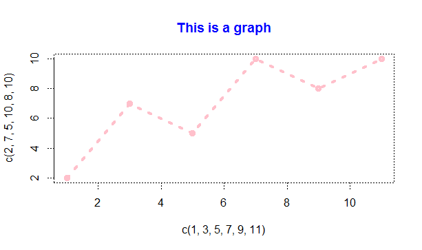
Graph With A Title
#Same graph with xlabel and ylabel added.
plot(c(1,3,5,7,9,11),c(2,7,5,10,8,10),type='o',lt=3,col='pink',lwd=4,main="This is a graph",col.main='blue',xlab="Time",ylab="Performance")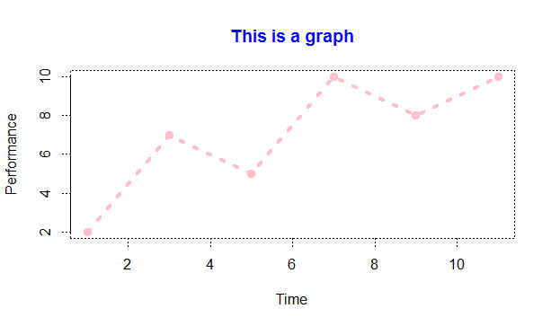
Graph With Title And Labels
Let us add a label to each of the data points in the graph using a text attribute.
labelset <-c('one','three','five','seven','nine','eleven')
x1<- c(1,3,5,7,9,11)
y1 <- c(2,7,5,10,8,10)
plot(x1,y1,type='o',lty=3,col='pink',lwd=4,main="This is a graph",col.main='blue',xlab="Time",ylab="Performance")
text(x1+0.5,y1,labelset,col='red')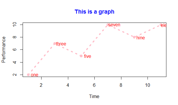
Graph With Data Labels
Finally, let us add a legend to the above graph using the legend() function.
legend('topleft',inset=0.05,"Performace",lty=3,col='pink',lwd=4)The position can be specified by either x and y coordinates or using a position like ‘topleft’ or ‘bottomright’. Inset refers to moving the legend box a little to the inside of the graph. The resulting graph now has a legend.
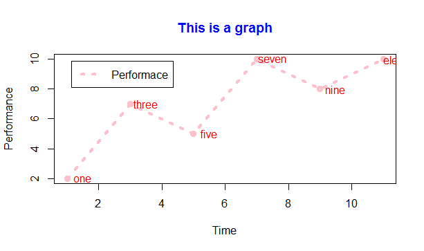
Graph With Legend
Overlaying Graphs
R also allows two graphs to be displayed on top of each other instead of creating a new window for every graph. This is done by calling a lines() function for the second graph rather than plot() again. These are most useful when performing comparisons of metrics or among different sets of values. Let us look at an example.
x=seq(2,10,0.1)
y1=x^2
y2=x^3
plot(x,y1,type='l',col='red')
lines(x,y2,col='green')
legend('bottomright',inset=0.05,c("Squares","Cubes"),lty=1,col=c("red","green"),title="Graph type")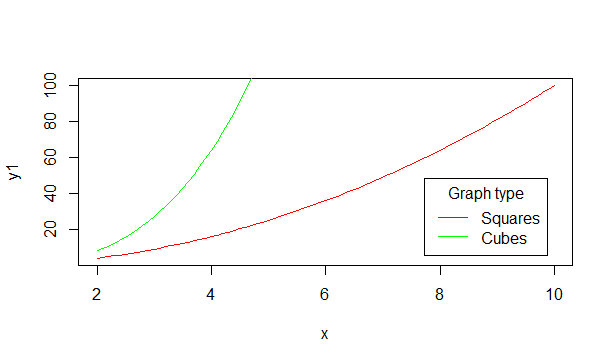
Overlaid Graph With Legend
Adding Lines to a Plot
Straight lines can be added to an existing plot using the simple abline() function. The abline() function takes 4 arguments, a, b, h, and v. The variables a and b represent the slope and intercept. H represents the y points for horizontal lines and v represents the x points for vertical lines.
Let us look at an example to make this clear. Try executing these three statements after building the above graph for squares and cubes.
abline(a=4,b=5,col='blue')
abline(h=c(4,6,8),col="dark green",lty=2)
abline(v=c(4,6,8),col="dark green",lty=2)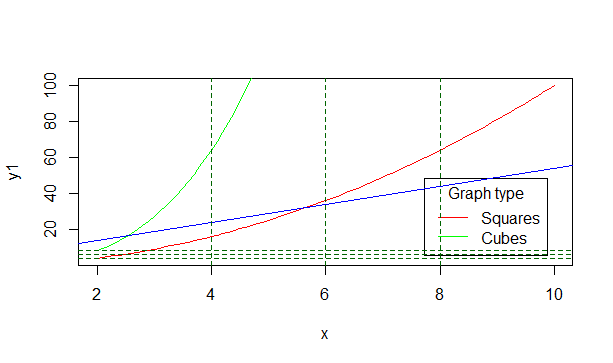
Graph With Lines
The first blue line is built with the slope and intercept specified. The next sets of three horizontal and vertical lines are drawn at the specified x and y values in the dotted line style as mentioned by lty=2.
This covers the basics of the plot function in R. When combined with other packages like ggplot2, R builds the most presentable and dynamic graphics as we will see in further tutorials.
Conclusion
The plot() function in R offers extensive capabilities for creating and customizing graphs. With its numerous parameters, you can tailor plots to your specific needs and enrich them with additional information. For more detailed guidance and advanced customization options, it's advisable to consult the official R documentation and other reputable resources.
Testen Sie Ihr Setup auf ccloud³
Registrieren Sie sich in der ccloud³ und erhalten Sie 200 € Startguthaben für Ihr Projekt – z. B. für eine PostgreSQL-VM mit automatischen Backups.