In diesem Tutorial werden wir ein NavigationView in unserer Android-Anwendung diskutieren und implementieren. Hier lernen wir, es so zu gestalten, dass es sich auch von rechts nach links öffnet.
NavigationView
NavigationView ist eine bessere und einfacher zu implementierende Alternative zu einem Navigation Drawer. NavigationDrawer erforderte, dass wir die Elemente mit einer ListView/RecyclerView durch Implementierung eines benutzerdefinierten Adapters implementieren. Mit der Einführung eines NavigationView benötigen wir nur, die Elemente mit Menüressourcen aufzublähen, die wir bald sehen werden. NavigationView wird in der Regel in einem DrawerLayout platziert.
Passende Infrastruktur bei centron
Node-Anwendungen wollen deployt werden: ccloud³ VMs mit vollem Root-Zugriff ab 3,12 € im Monat – oder gleich als Managed Server, wenn der Betrieb nicht bei Ihnen liegen soll. Cloud Server mieten →
Erste Schritte mit NavigationView
Android Studio bietet uns eine fertige Navigation Drawer Activity, die ein standardmäßiges Navigationsmenü implementiert. Sie können es aus dem folgenden Dialog auswählen.
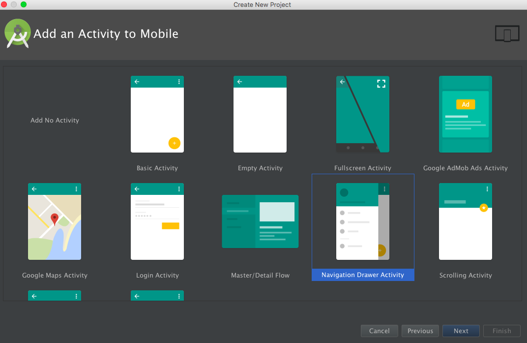
Verständnis des NavigationView
Die Klasse NavigationView erweitert FrameLayout. Sie ist im XML unter dem Tag wie folgt definiert:
<android.support.design.widget.NavigationView/>Das NavigationView besteht im Wesentlichen aus zwei Hauptkomponenten:
- HeaderView: Diese Ansicht wird typischerweise oben im Navigation Drawer angezeigt. Sie enthält in der Regel das Profilbild, den Namen, die E-Mail-Adresse und ein Hintergrundbild. Diese Ansicht ist in einer separaten Layout-Datei definiert, die wir gleich betrachten werden. Um das Layout in unser NavigationView einzufügen, wird der Parameter app:headerLayout verwendet
- Menü: Dies wird unter dem HeaderView angezeigt und enthält alle Navigationspunkte in Form einer Liste. Die Layout-Datei hierfür ist im Menüordner definiert. Um das Layout in das NavigationView einzufügen, wird der Parameter app:menus verwendet
Weitere wichtige XML-Attribute, die verwendet werden, um das NavigationView anzupassen, sind:
- app:itemTextColor: Ändert die Textfarbe
- app:itemIconTint: Ändert die Symbolfarbe
- app:itemBackground: Ändert die Hintergrundfarbe der Elemente
Lassen Sie uns die Projektstruktur der integrierten NavigationView-Vorlage betrachten. Das activity_main.xml ist das Layout für die MainActivity.
<?xml version="1.0" encoding="utf-8"?>
<android.support.v4.widget.DrawerLayout xmlns:android="https://schemas.android.com/apk/res/android"
    xmlns:app="https://schemas.android.com/apk/res-auto"
    xmlns:tools="https://schemas.android.com/tools"
    android:id="@+id/drawer_layout"
    android:layout_width="match_parent"
    android:layout_height="match_parent"
    android:fitsSystemWindows="true"
    tools:openDrawer="start">

    <include
        layout="@layout/app_bar_main"
        android:layout_width="match_parent"
        android:layout_height="match_parent" />

    <android.support.design.widget.NavigationView
        android:id="@+id/nav_view"
        android:layout_width="wrap_content"
        android:layout_height="match_parent"
        android:layout_gravity="start"
        android:fitsSystemWindows="true"
        app:headerLayout="@layout/nav_header_main"
        app:menu="@menu/activity_main_drawer" />

</android.support.v4.widget.DrawerLayout>
Hinweis: Das oben genannte DrawerLayout ist das Layout, das den Inhalt der Navigationsleiste und den Inhalt unserer App enthält. Das Layout app_bar_main.xml besteht aus einem CoordinatorLayout, das eine Toolbar, einen FloatingActionButton und ein content_main.xml-Layout enthält (das ein einfaches 'Hallo Welt'-TextView anzeigt). Die Layouts sind unten aufgeführt. app_bar_main.xml
<?xml version="1.0" encoding="utf-8"?>
<android.support.design.widget.CoordinatorLayout xmlns:android="https://schemas.android.com/apk/res/android"
    xmlns:app="https://schemas.android.com/apk/res-auto"
    xmlns:tools="https://schemas.android.com/tools"
    android:layout_width="match_parent"
    android:layout_height="match_parent"
    android:fitsSystemWindows="true"
    tools:context="com.journaldev.navigationviewstyling.MainActivity">

    <android.support.design.widget.AppBarLayout
        android:layout_width="match_parent"
        android:layout_height="wrap_content"
        android:theme="@style/AppTheme.AppBarOverlay">

        <android.support.v7.widget.Toolbar
            android:id="@+id/toolbar"
            android:layout_width="match_parent"
            android:layout_height="?attr/actionBarSize"
            android:background="?attr/colorPrimary"
            app:popupTheme="@style/AppTheme.PopupOverlay" />

    </android.support.design.widget.AppBarLayout>

    <include layout="@layout/content_main" />

    <android.support.design.widget.FloatingActionButton
        android:id="@+id/fab"
        android:layout_width="wrap_content"
        android:layout_height="wrap_content"
        android:layout_gravity="bottom|end"
        android:layout_margin="@dimen/fab_margin"
        android:src="@android:drawable/ic_dialog_email" />

</android.support.design.widget.CoordinatorLayout>
Das Layout content_main.xml ist unten aufgeführt:
<?xml version="1.0" encoding="utf-8"?>
<RelativeLayout xmlns:android="https://schemas.android.com/apk/res/android"
    xmlns:app="https://schemas.android.com/apk/res-auto"
    xmlns:tools="https://schemas.android.com/tools"
    android:layout_width="match_parent"
    android:layout_height="match_parent"
    android:paddingBottom="@dimen/activity_vertical_margin"
    android:paddingLeft="@dimen/activity_horizontal_margin"
    android:paddingRight="@dimen/activity_horizontal_margin"
    android:paddingTop="@dimen/activity_vertical_margin"
    app:layout_behavior="@string/appbar_scrolling_view_behavior"
    tools:context="com.journaldev.navigationviewstyling.MainActivity"
    tools:showIn="@layout/app_bar_main">

    <TextView
        android:layout_width="wrap_content"
        android:layout_height="wrap_content"
        android:text="Hello World!" />
</RelativeLayout>
Das standardmäßige headerLayout und das Menü für das NavigationView sind unten aufgeführt: nav_header_main.xml
<?xml version="1.0" encoding="utf-8"?>
<LinearLayout xmlns:android="https://schemas.android.com/apk/res/android"
    android:layout_width="match_parent"
    android:layout_height="@dimen/nav_header_height"
    android:background="@drawable/side_nav_bar"
    android:gravity="bottom"
    android:orientation="vertical"
    android:paddingBottom="@dimen/activity_vertical_margin"
    android:paddingLeft="@dimen/activity_horizontal_margin"
    android:paddingRight="@dimen/activity_horizontal_margin"
    android:paddingTop="@dimen/activity_vertical_margin"
    android:theme="@style/ThemeOverlay.AppCompat.Dark">

    <ImageView
        android:id="@+id/imageView"
        android:layout_width="wrap_content"
        android:layout_height="wrap_content"
        android:paddingTop="@dimen/nav_header_vertical_spacing"
        android:src="@android:drawable/sym_def_app_icon" />

    <TextView
        android:layout_width="match_parent"
        android:layout_height="wrap_content"
        android:paddingTop="@dimen/nav_header_vertical_spacing"
        android:text="Android Studio"
        android:textAppearance="@style/TextAppearance.AppCompat.Body1" />

    <TextView
        android:id="@+id/textView"
        android:layout_width="wrap_content"
        android:layout_height="wrap_content"
        android:text="android.studio@android.com" />

</LinearLayout>
activity_main_drawer.xml
<menu xmlns:android="https://schemas.android.com/apk/res/android">

    <group android:checkableBehavior="single">
        <item
            android:id="@+id/nav_camera"
            android:icon="@drawable/ic_menu_camera"
            android:title="Import" />
        <item
            android:id="@+id/nav_gallery"
            android:icon="@drawable/ic_menu_gallery"
            android:title="Gallery" />
        <item
            android:id="@+id/nav_slideshow"
            android:icon="@drawable/ic_menu_slideshow"
            android:title="Slideshow" />
        <item
            android:id="@+id/nav_manage"
            android:icon="@drawable/ic_menu_manage"
            android:title="Tools" />
    </group>

    <item android:title="Communicate">
        <menu>
            <item
                android:id="@+id/nav_share"
                android:icon="@drawable/ic_menu_share"
                android:title="Share" />
            <item
                android:id="@+id/nav_send"
                android:icon="@drawable/ic_menu_send"
                android:title="Send" />
        </menu>
    </item>

</menu>
Das XML-Attribut android:checkableBehavior ist für die gesamte Gruppe definiert und kann einen der drei unten aufgeführten Werte annehmen.
- single: Nur ein Element aus der Gruppe kann ausgewählt werden
- all: Alle Elemente können ausgewählt werden (Kontrollkästchen)
- none: Keine Elemente sind auswählbar
Das Attribut android:checkable wird verwendet, um das auswählbare Verhalten für einzelne Elemente festzulegen. Es akzeptiert Boolesche Werte. Hinweis: Verschachtelte Menüpunkte sind im Layout app:menus möglich. Die MainActivity.java ist unten gegeben
package com.journaldev.navigationviewstyling;

import android.os.Bundle;
import android.support.design.widget.FloatingActionButton;
import android.support.design.widget.Snackbar;
import android.view.View;
import android.support.design.widget.NavigationView;
import android.support.v4.view.GravityCompat;
import android.support.v4.widget.DrawerLayout;
import android.support.v7.app.ActionBarDrawerToggle;
import android.support.v7.app.AppCompatActivity;
import android.support.v7.widget.Toolbar;
import android.view.Menu;
import android.view.MenuItem;

public class MainActivity extends AppCompatActivity
        implements NavigationView.OnNavigationItemSelectedListener {

    @Override
    protected void onCreate(Bundle savedInstanceState) {
        super.onCreate(savedInstanceState);
        setContentView(R.layout.activity_main);
        Toolbar toolbar = (Toolbar) findViewById(R.id.toolbar);
        setSupportActionBar(toolbar);

        FloatingActionButton fab = (FloatingActionButton) findViewById(R.id.fab);
        fab.setOnClickListener(new View.OnClickListener() {
            @Override
            public void onClick(View view) {
                Snackbar.make(view, "Replace with your own action", Snackbar.LENGTH_LONG)
                        .setAction("Action", null).show();
            }
        });

        DrawerLayout drawer = (DrawerLayout) findViewById(R.id.drawer_layout);
        ActionBarDrawerToggle toggle = new ActionBarDrawerToggle(
                this, drawer, toolbar, R.string.navigation_drawer_open, R.string.navigation_drawer_close);
        //drawer.setDrawerListener(toggle);
        drawer.addDrawerListener(toggle);
        toggle.syncState();

        NavigationView navigationView = (NavigationView) findViewById(R.id.nav_view);
        navigationView.setNavigationItemSelectedListener(this);
    }

    @Override
    public void onBackPressed() {
        DrawerLayout drawer = (DrawerLayout) findViewById(R.id.drawer_layout);
        if (drawer.isDrawerOpen(GravityCompat.START)) {
            drawer.closeDrawer(GravityCompat.START);
        } else {
            super.onBackPressed();
        }
    }

    @Override
    public boolean onCreateOptionsMenu(Menu menu) {
        // Inflate the menu; this adds items to the action bar if it is present.
        getMenuInflater().inflate(R.menu.main, menu);
        return true;
    }

    @Override
    public boolean onOptionsItemSelected(MenuItem item) {
        // Handle action bar item clicks here. The action bar will
        // automatically handle clicks on the Home/Up button, so long
        // as you specify a parent activity in AndroidManifest.xml.
        int id = item.getItemId();

        //noinspection SimplifiableIfStatement
        if (id == R.id.action_settings) {
            return true;
        }

        return super.onOptionsItemSelected(item);
    }

    @SuppressWarnings("StatementWithEmptyBody")
    @Override
    public boolean onNavigationItemSelected(MenuItem item) {
        // Handle navigation view item clicks here.
        int id = item.getItemId();

        if (id == R.id.nav_camera) {
            // Handle the camera action
        } else if (id == R.id.nav_gallery) {

        } else if (id == R.id.nav_slideshow) {

        } else if (id == R.id.nav_manage) {

        } else if (id == R.id.nav_share) {

        } else if (id == R.id.nav_send) {

        }

        DrawerLayout drawer = (DrawerLayout) findViewById(R.id.drawer_layout);
        drawer.closeDrawer(GravityCompat.START);
        return true;
    }
}
Wichtige Schlussfolgerungen aus dem obigen Code sind unten gegeben:
Die MainActivity implementiert NavigationView.OnNavigationItemSelectedListener und überschreibt die Methode onNavigationItemSelected. Hier verarbeiten wir die Klicks auf die Menüpunkte und schließen den Drawer auf der linken Seite. Zeigen wir eine Toast-Nachricht für jedes der Elemente an, wie unten gezeigt.
@Override
   public boolean onNavigationItemSelected(MenuItem item) {
       int id = item.getItemId();

       if (id == R.id.nav_camera) {
           // Handle the camera action
           Toast.makeText(getApplicationContext(), "Camera is clicked", Toast.LENGTH_SHORT).show();

       } else if (id == R.id.nav_gallery) {
           Toast.makeText(getApplicationContext(), "Gallery is clicked", Toast.LENGTH_SHORT).show();

       } else if (id == R.id.nav_slideshow) {
           Toast.makeText(getApplicationContext(), "Slideshow is clicked", Toast.LENGTH_SHORT).show();

       } else if (id == R.id.nav_manage) {
           Toast.makeText(getApplicationContext(), "Tools is clicked", Toast.LENGTH_SHORT).show();

       } else if (id == R.id.nav_share) {
           Toast.makeText(getApplicationContext(), "Share is clicked", Toast.LENGTH_SHORT).show();

       } else if (id == R.id.nav_send) {
           Toast.makeText(getApplicationContext(), "Send is clicked", Toast.LENGTH_SHORT).show();

       }

       DrawerLayout drawer = (DrawerLayout) findViewById(R.id.drawer_layout);
       drawer.closeDrawer(GravityCompat.START);
       return true;
   }
Der ActionBarDrawerToggle wird initialisiert als:
ActionBarDrawerToggle toggle = new ActionBarDrawerToggle(
                this, drawer, toolbar, R.string.navigation_drawer_open, R.string.navigation_drawer_close);
Der ActionBarDrawerToggle wird zusammen mit einem DrawerLayout verwendet, um die empfohlene Funktionalität von Navigationsdrawern zu implementieren. Er wird wie folgt verwendet:
- Er fungiert als Listener für das Öffnen und Schließen von Drawern.
- Er stellt die Hamburger-Icons in der ToolBar/ActionBar bereit.
- Er ermöglicht die Animation zwischen dem Hamburger-Icon und dem Pfeil.
Hinweis: android.support.v4.app.ActionBarDrawerToggle ist veraltet. Verwenden Sie immer android.support.v7.app.ActionBarDrawerToggle als Ersatz.
Um einen Listener zum DrawerLayout hinzuzufügen, wird die folgende Methode verwendet. drawer.addDrawerListener(toggle); Dieser Listener wird verwendet, um über Drawer-Ereignisse informiert zu bleiben. Hinweis: drawer.setDrawerListener(toggle) ist jetzt veraltet.
toggle.syncState(): wird den Zustand des Icons synchronisieren und das Hamburger-Icon oder den Rückwärtspfeil anzeigen, je nachdem, ob der Drawer geschlossen oder geöffnet ist. Das Weglassen dieser Codezeile wird den Rückwärtspfeil nicht in das Hamburger-Icon ändern, wenn der Drawer geschlossen ist.
drawer.closeDrawer(GravityCompat.START): wird verwendet, um den Drawer zu schließen, indem die Schwerkraft auf START (standardmäßig links) gesetzt wird.
So sieht die standardmäßige NavigationView in einer Anwendung aus:
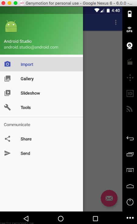
Beachten Sie, dass das zuletzt angeklickte Element immer in der ersten Gruppe hervorgehoben bleibt. Um die Hervorhebung zu entfernen, sobald der Drawer geschlossen wird, ändern Sie das android:checkableBehavior auf „none“. Die aktuelle NavigationView wird über der Statusleiste gezeichnet. Um sie unter die Statusleiste zu setzen, stellen Sie das android:fitsSystemWindows auf „false“ für die NavigationView.
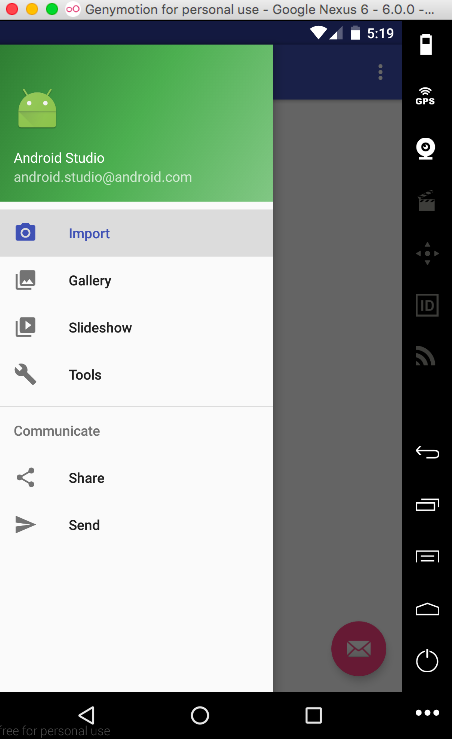
Mit den oben gesetzten Attributen können wir die NavigationView weiter anpassen, indem wir sie unter die Toolbar/ActionBar setzen (obwohl dies in den Material Design-Richtlinien nicht empfohlen wird), indem wir android:layout_marginTop="?attr/actionBarSize" in der NavigationView setzen und android:fitsSystemWindows="false" für CoordinatorLayout und DrawerLayout. Mit der oben durchgeführten Anpassung sieht das Ergebnis so aus:
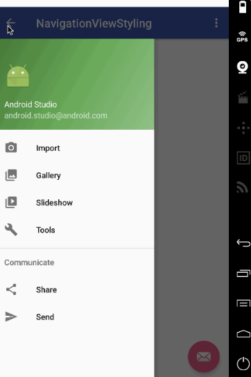
Sie sehen die weiße Statusleiste oben? Das liegt daran, dass android:fitSystemWindows für das CoordinatorLayout und das DrawerLayout auf false gesetzt ist. Das Stylen der Statusleiste in der styles.xml wie @color/colorPrimaryDark wird es nicht ändern. Wir benötigen einen besseren Ansatz. Die einzige Alternative besteht darin, das CoordinatorLayout zu entfernen (wir verwenden seine Animation auch nicht) und das DrawerLayout und die Toolbar in ein LinearLayout zu setzen. Hier sind die aktualisierten xml-Layouts: activity_main.xml
<?xml version="1.0" encoding="utf-8"?>
<LinearLayout xmlns:android="https://schemas.android.com/apk/res/android"
xmlns:app="https://schemas.android.com/apk/res-auto"
android:orientation="vertical"
android:layout_width="match_parent"
android:layout_height="match_parent">

<!-- The toolbar -->
<android.support.v7.widget.Toolbar
    android:id="@+id/toolbar"
    android:layout_height="wrap_content"
    android:layout_width="match_parent"
    android:fitsSystemWindows="true"
    android:minHeight="?attr/actionBarSize"
    android:theme="@style/AppTheme.AppBarOverlay"
    android:background="?attr/colorPrimary" />

<android.support.v4.widget.DrawerLayout
    xmlns:android="https://schemas.android.com/apk/res/android"
    android:id="@+id/drawer_layout"
    android:layout_width="match_parent"
    android:fitsSystemWindows="true"
    android:layout_height="match_parent">

    <include
        layout="@layout/app_bar_main"
        android:layout_width="match_parent"
        android:layout_height="match_parent" />

    <android.support.design.widget.NavigationView
        android:id="@+id/nav_view"
        android:layout_width="wrap_content"
        android:layout_height="match_parent"
        android:layout_gravity="start"
        android:fitsSystemWindows="true"
        app:headerLayout="@layout/nav_header_main"
        app:menu="@menu/activity_main_drawer" />

</android.support.v4.widget.DrawerLayout>

</LinearLayout>
android:fitSystemWindows="true" ist in der Toolbar notwendig. Wenn Sie es weglassen, enden Sie mit so etwas:
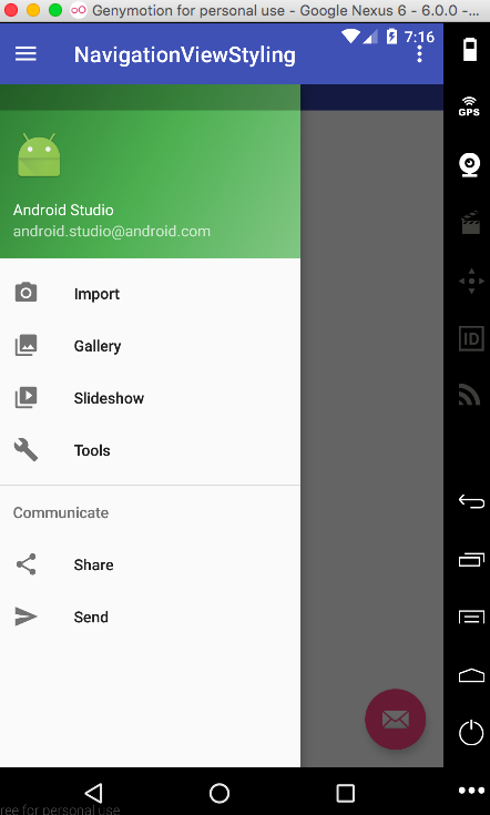
Hinweis: Das Entfernen des xml-Attributs android:theme="@style/AppTheme.AppBarOverlay" würde die Farbe der Toolbar-Elemente in Schwarz ändern. Probieren Sie es aus! app_bar_main.xml
<?xml version="1.0" encoding="utf-8"?>
<RelativeLayout xmlns:android="https://schemas.android.com/apk/res/android"
    xmlns:tools="https://schemas.android.com/tools"
    android:layout_width="match_parent"
    android:layout_height="match_parent"
    tools:context="com.journaldev.navigationviewstyling.MainActivity">

    <include layout="@layout/content_main" />

    <android.support.design.widget.FloatingActionButton
        android:id="@+id/fab"
        android:layout_width="wrap_content"
        android:layout_height="wrap_content"
        android:layout_gravity="bottom|end"
        android:src="@android:drawable/ic_dialog_email"
        android:layout_alignParentBottom="true"
        android:layout_margin="@dimen/activity_horizontal_margin"
        android:layout_alignParentRight="true"
        android:layout_alignParentEnd="true" />

</RelativeLayout>
So sieht die Anwendung jetzt aus.
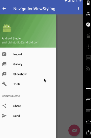
Oh warte! Die Farbe der Statusleiste ist identisch mit der Toolbar. Sie sollte eigentlich einen Tick dunkler sein. Lösung: Entfernen Sie einfach die folgende Zeile aus v-21/styles.xml
<item name="android:statusBarColor">@android:color/transparent</item>Lassen Sie uns die NavigationView so anpassen, dass sie von rechts nach links öffnet!
Projektstruktur
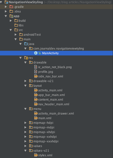
Wir werden unsere eigene Hamburger-Icon-PNG-Datei in den Drawable-Ordner hinzufügen, wie unten gezeigt.
Android NavigationView Beispielcode
Das Layout activity_main.xml ist nun wie folgt definiert
<?xml version="1.0" encoding="utf-8"?>
<LinearLayout xmlns:android="https://schemas.android.com/apk/res/android"
    xmlns:app="https://schemas.android.com/apk/res-auto"
    xmlns:tools="https://schemas.android.com/tools"
    android:orientation="vertical"
    android:layout_width="match_parent"
    android:layout_height="match_parent">

    <!-- The toolbar -->
    <RelativeLayout
        android:layout_width="match_parent"
        android:fitsSystemWindows="true"
        android:layout_height="wrap_content">

        <android.support.v7.widget.Toolbar
            android:id="@+id/toolbar"
            android:layout_width="match_parent"
            android:layout_height="wrap_content"
            android:minHeight="?attr/actionBarSize"
            android:background="?attr/colorPrimary"
            android:fitsSystemWindows="true"
            android:theme="@style/AppTheme.AppBarOverlay" />

        <FrameLayout
            android:id="@+id/drawer_button"
            android:layout_width="50dp"
            android:layout_height="?attr/actionBarSize"
            android:fitsSystemWindows="true"
            android:layout_alignParentRight="true"
            android:clickable="true">

            <ImageView
                android:layout_width="wrap_content"
                android:layout_height="wrap_content"
                android:layout_gravity="center_horizontal|center_vertical"
                android:src="@drawable/ic_action_not_black" />
        </FrameLayout>

    </RelativeLayout>

    <android.support.v4.widget.DrawerLayout
        xmlns:android="https://schemas.android.com/apk/res/android"
        android:id="@+id/drawer_layout"
        android:layout_width="match_parent"
        android:fitsSystemWindows="true"
        android:layout_height="match_parent"
        tools:openDrawer="end">

        <include
            layout="@layout/app_bar_main"
            android:layout_width="match_parent"
            android:layout_height="match_parent" />

        <android.support.design.widget.NavigationView
            android:id="@+id/nav_view"
            android:layout_width="wrap_content"
            android:layout_height="match_parent"
            android:layout_gravity="end"
            android:fitsSystemWindows="true"
            app:itemTextColor="#1d3f4c"
            app:itemIconTint="#cd4312"
            app:headerLayout="@layout/nav_header_main"
            app:menu="@menu/activity_main_drawer" />

    </android.support.v4.widget.DrawerLayout>

</LinearLayout>
Wir haben die Toolbar mit einem FrameLayout in einem RelativeLayout platziert. android:fitSystemWindows muss in allen dreien auf true gesetzt sein. Das DrawerLayout enthält tools:openDrawer="end" und android:layout_gravity="end", was die Standardseite des Drawers nach rechts ändert. Idealerweise sieht ein kreisförmiges Kopfbild schön in einer NavigationView aus. Wir werden die Abhängigkeit de.hdodenhof.circleimageview.CircleImageView kompilieren und in unserer nav_header_main.xml-Datei verwenden, wie unten gezeigt. nav_header_main.xml
<?xml version="1.0" encoding="utf-8"?>
<LinearLayout xmlns:android="https://schemas.android.com/apk/res/android"
    android:layout_width="match_parent"
    android:layout_height="@dimen/nav_header_height"
    android:background="@drawable/side_nav_bar"
    android:gravity="bottom"
    android:orientation="vertical"
    android:paddingBottom="@dimen/activity_vertical_margin"
    android:paddingLeft="@dimen/activity_horizontal_margin"
    android:paddingRight="@dimen/activity_horizontal_margin"
    android:paddingTop="@dimen/activity_vertical_margin"
    android:theme="@style/ThemeOverlay.AppCompat.Dark">

    <de.hdodenhof.circleimageview.CircleImageView
        android:id="@+id/imageView"
        android:layout_width="75dp"
        android:layout_height="75dp"
        android:paddingTop="@dimen/nav_header_vertical_spacing"
        android:src="@drawable/profile" />

    <TextView
        android:layout_width="match_parent"
        android:layout_height="wrap_content"
        android:paddingTop="@dimen/nav_header_vertical_spacing"
        android:text="Anupam Chugh"
        android:textAppearance="@style/TextAppearance.AppCompat.Body1" />

    <TextView
        android:id="@+id/textView"
        android:layout_width="wrap_content"
        android:layout_height="wrap_content"
        android:text="www.JournalDev.com" />

</LinearLayout>
Die anderen XML-Layouts sind identisch mit den oben besprochenen. Die MainActivity.java ist unten angegeben
package com.journaldev.navigationviewtyling;

import android.os.Bundle;
import android.support.design.widget.FloatingActionButton;
import android.support.design.widget.Snackbar;
import android.view.View;
import android.support.design.widget.NavigationView;
import android.support.v4.view.GravityCompat;
import android.support.v4.widget.DrawerLayout;
import android.support.v7.app.ActionBarDrawerToggle;
import android.support.v7.app.AppCompatActivity;
import android.support.v7.widget.Toolbar;
import android.view.MenuItem;
import android.widget.Toast;

public class MainActivity extends AppCompatActivity
        implements NavigationView.OnNavigationItemSelectedListener {

    DrawerLayout drawer;

    @Override
    protected void onCreate(Bundle savedInstanceState) {
        super.onCreate(savedInstanceState);
        setContentView(R.layout.activity_main);
        Toolbar toolbar = (Toolbar) findViewById(R.id.toolbar);
        setSupportActionBar(toolbar);

        drawer = (DrawerLayout) findViewById(R.id.drawer_layout);

        findViewById(R.id.drawer_button).setOnClickListener(new View.OnClickListener() {
            @Override
            public void onClick(View v) {
                // open right drawer

                if (drawer.isDrawerOpen(GravityCompat.END)) {
                    drawer.closeDrawer(GravityCompat.END);
                }
                else
                drawer.openDrawer(GravityCompat.END);
            }
        });

        FloatingActionButton fab = (FloatingActionButton) findViewById(R.id.fab);
        fab.setOnClickListener(new View.OnClickListener() {
            @Override
            public void onClick(View view) {
                Snackbar.make(view, "Replace with your own action", Snackbar.LENGTH_LONG)
                        .setAction("Action", null).show();
            }
        });

        ActionBarDrawerToggle toggle = new ActionBarDrawerToggle(
                this, drawer, toolbar, R.string.navigation_drawer_open, R.string.navigation_drawer_close);
        toggle.setDrawerIndicatorEnabled(false);
        drawer.addDrawerListener(toggle);

        toggle.syncState();


        NavigationView navigationView = (NavigationView) findViewById(R.id.nav_view);
        navigationView.setNavigationItemSelectedListener(this);
    }

    @Override
    public void onBackPressed() {

        if (drawer.isDrawerOpen(GravityCompat.END)) {
            drawer.closeDrawer(GravityCompat.END);
        } else {
            super.onBackPressed();
        }
    }


    @SuppressWarnings("StatementWithEmptyBody")
    @Override
    public boolean onNavigationItemSelected(MenuItem item) {
        // Handle navigation view item clicks here.
        int id = item.getItemId();

        if (id == R.id.nav_camera) {
            // Handle the camera action
            Toast.makeText(getApplicationContext(), "Camera is clicked", Toast.LENGTH_SHORT).show();

        } else if (id == R.id.nav_gallery) {
            Toast.makeText(getApplicationContext(), "Gallery is clicked", Toast.LENGTH_SHORT).show();

        } else if (id == R.id.nav_slideshow) {
            Toast.makeText(getApplicationContext(), "Slideshow is clicked", Toast.LENGTH_SHORT).show();

        } else if (id == R.id.nav_manage) {
            Toast.makeText(getApplicationContext(), "Tools is clicked", Toast.LENGTH_SHORT).show();

        } else if (id == R.id.nav_share) {
            Toast.makeText(getApplicationContext(), "Share is clicked", Toast.LENGTH_SHORT).show();

        } else if (id == R.id.nav_send) {
            Toast.makeText(getApplicationContext(), "Send is clicked", Toast.LENGTH_SHORT).show();

        }

        DrawerLayout drawer = (DrawerLayout) findViewById(R.id.drawer_layout);
        drawer.closeDrawer(GravityCompat.END);
        return true;
    }
}
Wichtige Schlussfolgerungen aus dem obigen Code sind:
toggle.setDrawerIndicatorEnabled(false); : Diese Zeile wird verwendet, um das standardmäßige Hamburger-Icon, das links angezeigt wurde, zu verbergen.
Alle GravityCompat-Konstanten sind jetzt auf END statt auf START geändert.
Die Ausgabe der Anwendung in Aktion ist unten gegeben.
Damit endet das Tutorial zur Android NavigationView.
Testen Sie Ihr Setup auf ccloud³
Registrieren Sie sich in der ccloud³ und erhalten Sie 200 € Startguthaben für Ihr Projekt – z. B. für eine PostgreSQL-VM mit automatischen Backups.