
NavigationView In Android
In this tutorial, we’ll discuss and implement a NavigationView in our android application. Here, we’ll learn to style it such that it opens from right to left too.
NavigationView
NavigationView is a better and easier to implement alternative to a Navigation Drawer. NavigationDrawer required us to implement the items using a ListView/RecyclerView by implementing a custom Adapter. With the introduction of a NavigationView all we require is to inflate the items using menu resources that we’ll see soon. NavigationView is generally placed inside a DrawerLayout.
NavigationView Getting Started
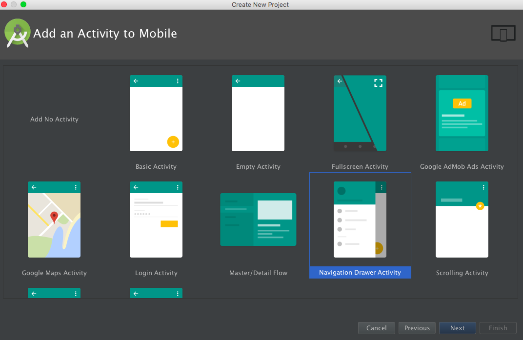
Android Studio provides us a ready made Navigation Drawer Activity that implements a standard Navigation Menu. You can choose it from the following dialog.
Understanding the NavigationView
The NavigationView class extends FrameLayout. It’s defined in the xml under the tag as:
<android.support.design.widget.NavigationView/>
The NavigationView essentially consists of two major components:
- HeaderView : This View is typically displayed at the top of the Navigation Drawer. It essentially holds the profile picture, name email address and a background cover pic. This view is defined in a separate layout file that we’ll look at in a bit. To add the layout into our NavigationView, the app:headerLayout parameter is used
- Menu : This is displayed below the HeaderView and it contains all the navigation items in the form of a list. The layout file for this is defined in the menus folder. To add the layout into the NavigationView , the app:menus parameter is used
Other important XML attributes that are used to customise the NavigationView are:
- app:itemTextColor : This changes the text color
- app:itemIconTint : This changes the icon color
- app:itemBackground : This changes the item background color
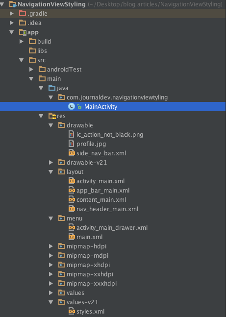
Let’s look into the Project Structure of the inbuilt NavigationView template. The activity_main.xml is the layout for the MainActivity.
<?xml version="1.0" encoding="utf-8"?>
<android.support.v4.widget.DrawerLayout xmlns:android="https://schemas.android.com/apk/res/android"
    xmlns:app="https://schemas.android.com/apk/res-auto"
    xmlns:tools="https://schemas.android.com/tools"
    android:id="@+id/drawer_layout"
    android:layout_width="match_parent"
    android:layout_height="match_parent"
    android:fitsSystemWindows="true"
    tools:openDrawer="start">

    <include
        layout="@layout/app_bar_main"
        android:layout_width="match_parent"
        android:layout_height="match_parent" />

    <android.support.design.widget.NavigationView
        android:id="@+id/nav_view"
        android:layout_width="wrap_content"
        android:layout_height="match_parent"
        android:layout_gravity="start"
        android:fitsSystemWindows="true"
        app:headerLayout="@layout/nav_header_main"
        app:menu="@menu/activity_main_drawer" />

</android.support.v4.widget.DrawerLayout>
Note: The above DrawerLayout is the layout that holds the navigation drawer content and our app’s content. The app_bar_main.xml layout consists of a CoordinatorLayout that holds a ToolBar, a FloatingActionButton and a content_main.xml layout(which displays a basic ‘Hello World’ TextView). The layouts are listed below. app_bar_main.xml
<?xml version="1.0" encoding="utf-8"?>
<android.support.design.widget.CoordinatorLayout xmlns:android="https://schemas.android.com/apk/res/android"
    xmlns:app="https://schemas.android.com/apk/res-auto"
    xmlns:tools="https://schemas.android.com/tools"
    android:layout_width="match_parent"
    android:layout_height="match_parent"
    android:fitsSystemWindows="true"
    tools:context="com.journaldev.navigationviewstyling.MainActivity">

    <android.support.design.widget.AppBarLayout
        android:layout_width="match_parent"
        android:layout_height="wrap_content"
        android:theme="@style/AppTheme.AppBarOverlay">

        <android.support.v7.widget.Toolbar
            android:id="@+id/toolbar"
            android:layout_width="match_parent"
            android:layout_height="?attr/actionBarSize"
            android:background="?attr/colorPrimary"
            app:popupTheme="@style/AppTheme.PopupOverlay" />

    </android.support.design.widget.AppBarLayout>

    <include layout="@layout/content_main" />

    <android.support.design.widget.FloatingActionButton
        android:id="@+id/fab"
        android:layout_width="wrap_content"
        android:layout_height="wrap_content"
        android:layout_gravity="bottom|end"
        android:layout_margin="@dimen/fab_margin"
        android:src="@android:drawable/ic_dialog_email" />

</android.support.design.widget.CoordinatorLayout>
The content_main.xml layout is listed below:
<?xml version="1.0" encoding="utf-8"?>
<RelativeLayout xmlns:android="https://schemas.android.com/apk/res/android"
    xmlns:app="https://schemas.android.com/apk/res-auto"
    xmlns:tools="https://schemas.android.com/tools"
    android:layout_width="match_parent"
    android:layout_height="match_parent"
    android:paddingBottom="@dimen/activity_vertical_margin"
    android:paddingLeft="@dimen/activity_horizontal_margin"
    android:paddingRight="@dimen/activity_horizontal_margin"
    android:paddingTop="@dimen/activity_vertical_margin"
    app:layout_behavior="@string/appbar_scrolling_view_behavior"
    tools:context="com.journaldev.navigationviewstyling.MainActivity"
    tools:showIn="@layout/app_bar_main">

    <TextView
        android:layout_width="wrap_content"
        android:layout_height="wrap_content"
        android:text="Hello World!" />
</RelativeLayout>
The default headerLayout and the menu for the NavigationView are listed below: nav_header_main.xml
<?xml version="1.0" encoding="utf-8"?>
<LinearLayout xmlns:android="https://schemas.android.com/apk/res/android"
    android:layout_width="match_parent"
    android:layout_height="@dimen/nav_header_height"
    android:background="@drawable/side_nav_bar"
    android:gravity="bottom"
    android:orientation="vertical"
    android:paddingBottom="@dimen/activity_vertical_margin"
    android:paddingLeft="@dimen/activity_horizontal_margin"
    android:paddingRight="@dimen/activity_horizontal_margin"
    android:paddingTop="@dimen/activity_vertical_margin"
    android:theme="@style/ThemeOverlay.AppCompat.Dark">

    <ImageView
        android:id="@+id/imageView"
        android:layout_width="wrap_content"
        android:layout_height="wrap_content"
        android:paddingTop="@dimen/nav_header_vertical_spacing"
        android:src="@android:drawable/sym_def_app_icon" />

    <TextView
        android:layout_width="match_parent"
        android:layout_height="wrap_content"
        android:paddingTop="@dimen/nav_header_vertical_spacing"
        android:text="Android Studio"
        android:textAppearance="@style/TextAppearance.AppCompat.Body1" />

    <TextView
        android:id="@+id/textView"
        android:layout_width="wrap_content"
        android:layout_height="wrap_content"
        android:text="android.studio@android.com" />

</LinearLayout>
activity_main_drawer.xml
<menu xmlns:android="https://schemas.android.com/apk/res/android">

    <group android:checkableBehavior="single">
        <item
            android:id="@+id/nav_camera"
            android:icon="@drawable/ic_menu_camera"
            android:title="Import" />
        <item
            android:id="@+id/nav_gallery"
            android:icon="@drawable/ic_menu_gallery"
            android:title="Gallery" />
        <item
            android:id="@+id/nav_slideshow"
            android:icon="@drawable/ic_menu_slideshow"
            android:title="Slideshow" />
        <item
            android:id="@+id/nav_manage"
            android:icon="@drawable/ic_menu_manage"
            android:title="Tools" />
    </group>

    <item android:title="Communicate">
        <menu>
            <item
                android:id="@+id/nav_share"
                android:icon="@drawable/ic_menu_share"
                android:title="Share" />
            <item
                android:id="@+id/nav_send"
                android:icon="@drawable/ic_menu_send"
                android:title="Send" />
        </menu>
    </item>

</menu>
The android:checkableBehavior xml attribute is defined for the entire group and it takes either of the three values listed below.
- single : Only one item from the group can be checked
- all : All items can be checked (checkboxes)
- none : No items are checkable
The android:checkable attribute is used for setting the checkable behaviour for individual items. It accepts boolean values. Note: Nested menu items are possible inside the app:menus layout The MainActivity.java is given below
package com.journaldev.navigationviewstyling;

import android.os.Bundle;
import android.support.design.widget.FloatingActionButton;
import android.support.design.widget.Snackbar;
import android.view.View;
import android.support.design.widget.NavigationView;
import android.support.v4.view.GravityCompat;
import android.support.v4.widget.DrawerLayout;
import android.support.v7.app.ActionBarDrawerToggle;
import android.support.v7.app.AppCompatActivity;
import android.support.v7.widget.Toolbar;
import android.view.Menu;
import android.view.MenuItem;

public class MainActivity extends AppCompatActivity
        implements NavigationView.OnNavigationItemSelectedListener {

    @Override
    protected void onCreate(Bundle savedInstanceState) {
        super.onCreate(savedInstanceState);
        setContentView(R.layout.activity_main);
        Toolbar toolbar = (Toolbar) findViewById(R.id.toolbar);
        setSupportActionBar(toolbar);

        FloatingActionButton fab = (FloatingActionButton) findViewById(R.id.fab);
        fab.setOnClickListener(new View.OnClickListener() {
            @Override
            public void onClick(View view) {
                Snackbar.make(view, "Replace with your own action", Snackbar.LENGTH_LONG)
                        .setAction("Action", null).show();
            }
        });

        DrawerLayout drawer = (DrawerLayout) findViewById(R.id.drawer_layout);
        ActionBarDrawerToggle toggle = new ActionBarDrawerToggle(
                this, drawer, toolbar, R.string.navigation_drawer_open, R.string.navigation_drawer_close);
        //drawer.setDrawerListener(toggle);
        drawer.addDrawerListener(toggle);
        toggle.syncState();

        NavigationView navigationView = (NavigationView) findViewById(R.id.nav_view);
        navigationView.setNavigationItemSelectedListener(this);
    }

    @Override
    public void onBackPressed() {
        DrawerLayout drawer = (DrawerLayout) findViewById(R.id.drawer_layout);
        if (drawer.isDrawerOpen(GravityCompat.START)) {
            drawer.closeDrawer(GravityCompat.START);
        } else {
            super.onBackPressed();
        }
    }

    @Override
    public boolean onCreateOptionsMenu(Menu menu) {
        // Inflate the menu; this adds items to the action bar if it is present.
        getMenuInflater().inflate(R.menu.main, menu);
        return true;
    }

    @Override
    public boolean onOptionsItemSelected(MenuItem item) {
        // Handle action bar item clicks here. The action bar will
        // automatically handle clicks on the Home/Up button, so long
        // as you specify a parent activity in AndroidManifest.xml.
        int id = item.getItemId();

        //noinspection SimplifiableIfStatement
        if (id == R.id.action_settings) {
            return true;
        }

        return super.onOptionsItemSelected(item);
    }

    @SuppressWarnings("StatementWithEmptyBody")
    @Override
    public boolean onNavigationItemSelected(MenuItem item) {
        // Handle navigation view item clicks here.
        int id = item.getItemId();

        if (id == R.id.nav_camera) {
            // Handle the camera action
        } else if (id == R.id.nav_gallery) {

        } else if (id == R.id.nav_slideshow) {

        } else if (id == R.id.nav_manage) {

        } else if (id == R.id.nav_share) {

        } else if (id == R.id.nav_send) {

        }

        DrawerLayout drawer = (DrawerLayout) findViewById(R.id.drawer_layout);
        drawer.closeDrawer(GravityCompat.START);
        return true;
    }
}
Important inferences drawn from the above piece of code are given below:
The MainActivity implements NavigationView.OnNavigationItemSelectedListener and overrides the method onNavigationItemSelected. We handle the menu item clicks here and close the Drawer towards the left. Let’s display a Toast message for each of the items as show below.
 @Override
    public boolean onNavigationItemSelected(MenuItem item) {
        int id = item.getItemId();

        if (id == R.id.nav_camera) {
            // Handle the camera action
            Toast.makeText(getApplicationContext(), "Camera is clicked", Toast.LENGTH_SHORT).show();

        } else if (id == R.id.nav_gallery) {
            Toast.makeText(getApplicationContext(), "Gallery is clicked", Toast.LENGTH_SHORT).show();

        } else if (id == R.id.nav_slideshow) {
            Toast.makeText(getApplicationContext(), "Slideshow is clicked", Toast.LENGTH_SHORT).show();

        } else if (id == R.id.nav_manage) {
            Toast.makeText(getApplicationContext(), "Tools is clicked", Toast.LENGTH_SHORT).show();

        } else if (id == R.id.nav_share) {
            Toast.makeText(getApplicationContext(), "Share is clicked", Toast.LENGTH_SHORT).show();

        } else if (id == R.id.nav_send) {
            Toast.makeText(getApplicationContext(), "Send is clicked", Toast.LENGTH_SHORT).show();

        }

        DrawerLayout drawer = (DrawerLayout) findViewById(R.id.drawer_layout);
        drawer.closeDrawer(GravityCompat.START);
        return true;
    }
The ActionBarDrawerToggle is initialised as:
ActionBarDrawerToggle toggle = new ActionBarDrawerToggle(
                this, drawer, toolbar, R.string.navigation_drawer_open, R.string.navigation_drawer_close);
The ActionBarDrawerToggle is used with a DrawerLayout to implement the recommended functionality of Navigation Drawers. It has the following usages:
- It acts as a listener, for opening and closing of drawers.
- It provides the hamburger icons in the ToolBar/ActionBar.
- It’s allows for the animation between the hamburger icon and the arrow to exist.
Note: android.support.v4.app.ActionBarDrawerToggle is deprecated. Always use android.support.v7.app.ActionBarDrawerToggle as a replacement.
To add a listener on the DrawerLayout the following method is used. drawer.addDrawerListener(toggle); This listener is used to keep notified of drawer events. Note: drawer.setDrawerListener(toggle) is now deprecated.
toggle.syncState(): will synchronise the icon’s state and display the hamburger icon or back arrow depending on whether the drawer is closed or open. Omitting this line of code won’t change the back arrow to the hamburger icon when the drawer is closed.
drawer.closeDrawer(GravityCompat.START): is used to close the drawer by setting the gravity to START (left by default)
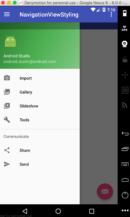
Here’s how the default NavigationView looks like in an application:
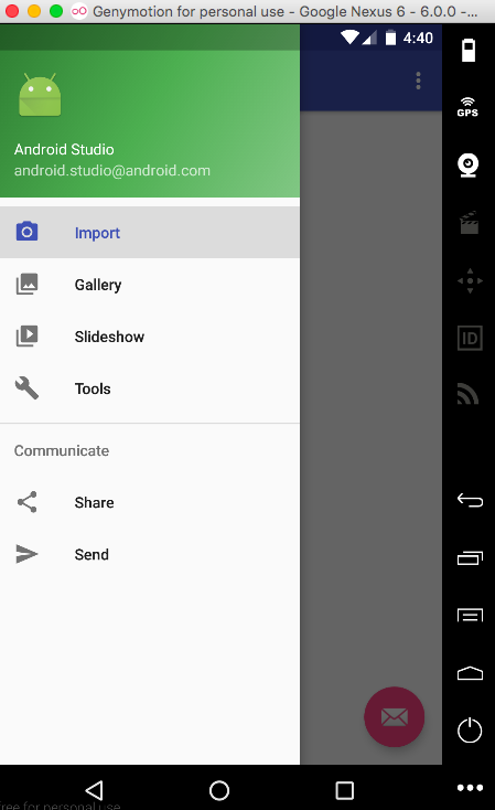
Note that the last clicked item always stays highlighted in the first group. To remove the highlight as soon as the drawer is closed change the android:checkableBehavior to “none”. The current NavigationView is drawn over the status bar. To put it beneath the status bar set the android:fitsSystemWindows as “false” for the NavigationView.
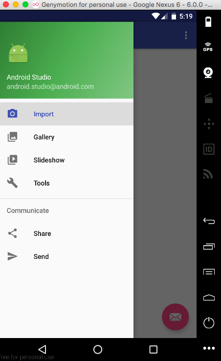
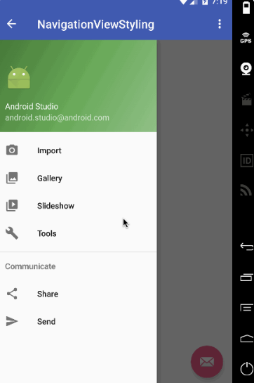
Now with the above attributes set we can further style the NavigationView by putting it under the Toolbar/ActionBar (Though this is not recommended in the Material Design Guidelines) by setting android:layout_marginTop=”?attr/actionBarSize” in the NavigationView and also setting android:fitsSystemWindows=”false” for CoordinatorLayout and DrawerLayout. With the above customization done, this is how the output looks:
You see the white status bar at the top? It’s due to the android:fitSystemWindows set to false for CoordinatorLayout and the DrawerLayout. Styling the status bar in the styles.xml like @color/colorPrimaryDark won’t change it. We need a better approach. The only alternative is to get rid of the CoordinatorLayout (we aren’t using its animation either) and to put the DrawerLayout and Toolbar inside a LinearLayout. Here are the updated xml layouts: activity_main.xml
<?xml version="1.0" encoding="utf-8"?>
<LinearLayout xmlns:android="https://schemas.android.com/apk/res/android"
xmlns:app="https://schemas.android.com/apk/res-auto"
android:orientation="vertical"
android:layout_width="match_parent"
android:layout_height="match_parent">

<!-- The toolbar -->
<android.support.v7.widget.Toolbar
    android:id="@+id/toolbar"
    android:layout_height="wrap_content"
    android:layout_width="match_parent"
    android:fitsSystemWindows="true"
    android:minHeight="?attr/actionBarSize"
    android:theme="@style/AppTheme.AppBarOverlay"
    android:background="?attr/colorPrimary" />

<android.support.v4.widget.DrawerLayout
    xmlns:android="https://schemas.android.com/apk/res/android"
    android:id="@+id/drawer_layout"
    android:layout_width="match_parent"
    android:fitsSystemWindows="true"
    android:layout_height="match_parent">

    <include
        layout="@layout/app_bar_main"
        android:layout_width="match_parent"
        android:layout_height="match_parent" />

    <android.support.design.widget.NavigationView
        android:id="@+id/nav_view"
        android:layout_width="wrap_content"
        android:layout_height="match_parent"
        android:layout_gravity="start"
        android:fitsSystemWindows="true"
        app:headerLayout="@layout/nav_header_main"
        app:menu="@menu/activity_main_drawer" />

</android.support.v4.widget.DrawerLayout>

</LinearLayout>
android:fitSystemWindows=”true” is necessary in the Toolbar. Omitting it, you’ll end up with something like this!
Note: Removing the xml attribute android:theme=”@style/AppTheme.AppBarOverlay” would change the Toolbar items color to black. Give it a go! app_bar_main.xml
<?xml version="1.0" encoding="utf-8"?>
<RelativeLayout xmlns:android="https://schemas.android.com/apk/res/android"
    xmlns:tools="https://schemas.android.com/tools"
    android:layout_width="match_parent"
    android:layout_height="match_parent"
    tools:context="com.journaldev.navigationviewstyling.MainActivity">

    <include layout="@layout/content_main" />

    <android.support.design.widget.FloatingActionButton
        android:id="@+id/fab"
        android:layout_width="wrap_content"
        android:layout_height="wrap_content"
        android:layout_gravity="bottom|end"
        android:src="@android:drawable/ic_dialog_email"
        android:layout_alignParentBottom="true"
        android:layout_margin="@dimen/activity_horizontal_margin"
        android:layout_alignParentRight="true"
        android:layout_alignParentEnd="true" />

</RelativeLayout>
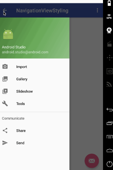
This is how the application looks now.
Oh wait! The status bar color is identical with the Toolbar. It was supposed to be a shade darker. Solution: Just remove the following line from v-21/styles.xml
<item name="android:statusBarColor">@android:color/transparent</item>
Let’s customise the NavigationView such that it opens from right to left!
Project Structure
We’ll be adding our own hamburger icon png file into the drawable folder as shown below.
Android NavigationView Example Code
The activity_main.xml layout is now defined as
<?xml version="1.0" encoding="utf-8"?>
<LinearLayout xmlns:android="https://schemas.android.com/apk/res/android"
    xmlns:app="https://schemas.android.com/apk/res-auto"
    xmlns:tools="https://schemas.android.com/tools"
    android:orientation="vertical"
    android:layout_width="match_parent"
    android:layout_height="match_parent">

    <!-- The toolbar -->
    <RelativeLayout
        android:layout_width="match_parent"
        android:fitsSystemWindows="true"
        android:layout_height="wrap_content">

        <android.support.v7.widget.Toolbar
            android:id="@+id/toolbar"
            android:layout_width="match_parent"
            android:layout_height="wrap_content"
            android:minHeight="?attr/actionBarSize"
            android:background="?attr/colorPrimary"
            android:fitsSystemWindows="true"
            android:theme="@style/AppTheme.AppBarOverlay" />

        <FrameLayout
            android:id="@+id/drawer_button"
            android:layout_width="50dp"
            android:layout_height="?attr/actionBarSize"
            android:fitsSystemWindows="true"
            android:layout_alignParentRight="true"
            android:clickable="true">

            <ImageView
                android:layout_width="wrap_content"
                android:layout_height="wrap_content"
                android:layout_gravity="center_horizontal|center_vertical"
                android:src="@drawable/ic_action_not_black" />
        </FrameLayout>

    </RelativeLayout>

    <android.support.v4.widget.DrawerLayout
        xmlns:android="https://schemas.android.com/apk/res/android"
        android:id="@+id/drawer_layout"
        android:layout_width="match_parent"
        android:fitsSystemWindows="true"
        android:layout_height="match_parent"
        tools:openDrawer="end">

        <include
            layout="@layout/app_bar_main"
            android:layout_width="match_parent"
            android:layout_height="match_parent" />

        <android.support.design.widget.NavigationView
            android:id="@+id/nav_view"
            android:layout_width="wrap_content"
            android:layout_height="match_parent"
            android:layout_gravity="end"
            android:fitsSystemWindows="true"
            app:itemTextColor="#1d3f4c"
            app:itemIconTint="#cd4312"
            app:headerLayout="@layout/nav_header_main"
            app:menu="@menu/activity_main_drawer" />

    </android.support.v4.widget.DrawerLayout>

</LinearLayout>
We’ve placed the Toolbar with a FrameLayout inside a RelativeLayout. android:fitSystemWindows needs to be set true in all three of them. The DrawerLayout contains tools:openDrawer=”end” and android:layout_gravity=”end” which changes the default side of the drawer to right. Ideally a circular header image looks beautiful inside a NavigationView. We’ll compile the dependency de.hdodenhof.circleimageview.CircleImageView and use that in our nav_header_main.xml file as shown below. nav_header_main.xml
<?xml version="1.0" encoding="utf-8"?>
<LinearLayout xmlns:android="https://schemas.android.com/apk/res/android"
    android:layout_width="match_parent"
    android:layout_height="@dimen/nav_header_height"
    android:background="@drawable/side_nav_bar"
    android:gravity="bottom"
    android:orientation="vertical"
    android:paddingBottom="@dimen/activity_vertical_margin"
    android:paddingLeft="@dimen/activity_horizontal_margin"
    android:paddingRight="@dimen/activity_horizontal_margin"
    android:paddingTop="@dimen/activity_vertical_margin"
    android:theme="@style/ThemeOverlay.AppCompat.Dark">

    <de.hdodenhof.circleimageview.CircleImageView
        android:id="@+id/imageView"
        android:layout_width="75dp"
        android:layout_height="75dp"
        android:paddingTop="@dimen/nav_header_vertical_spacing"
        android:src="@drawable/profile" />

    <TextView
        android:layout_width="match_parent"
        android:layout_height="wrap_content"
        android:paddingTop="@dimen/nav_header_vertical_spacing"
        android:text="Anupam Chugh"
        android:textAppearance="@style/TextAppearance.AppCompat.Body1" />

    <TextView
        android:id="@+id/textView"
        android:layout_width="wrap_content"
        android:layout_height="wrap_content"
        android:text="www.JournalDev.com" />

</LinearLayout>
The other xml layouts are identical to what were discussed above. The MainActivity.java is given below
package com.journaldev.navigationviewtyling;

import android.os.Bundle;
import android.support.design.widget.FloatingActionButton;
import android.support.design.widget.Snackbar;
import android.view.View;
import android.support.design.widget.NavigationView;
import android.support.v4.view.GravityCompat;
import android.support.v4.widget.DrawerLayout;
import android.support.v7.app.ActionBarDrawerToggle;
import android.support.v7.app.AppCompatActivity;
import android.support.v7.widget.Toolbar;
import android.view.MenuItem;
import android.widget.Toast;

public class MainActivity extends AppCompatActivity
        implements NavigationView.OnNavigationItemSelectedListener {

    DrawerLayout drawer;

    @Override
    protected void onCreate(Bundle savedInstanceState) {
        super.onCreate(savedInstanceState);
        setContentView(R.layout.activity_main);
        Toolbar toolbar = (Toolbar) findViewById(R.id.toolbar);
        setSupportActionBar(toolbar);

        drawer = (DrawerLayout) findViewById(R.id.drawer_layout);

        findViewById(R.id.drawer_button).setOnClickListener(new View.OnClickListener() {
            @Override
            public void onClick(View v) {
                // open right drawer

                if (drawer.isDrawerOpen(GravityCompat.END)) {
                    drawer.closeDrawer(GravityCompat.END);
                }
                else
                drawer.openDrawer(GravityCompat.END);
            }
        });

        FloatingActionButton fab = (FloatingActionButton) findViewById(R.id.fab);
        fab.setOnClickListener(new View.OnClickListener() {
            @Override
            public void onClick(View view) {
                Snackbar.make(view, "Replace with your own action", Snackbar.LENGTH_LONG)
                        .setAction("Action", null).show();
            }
        });

        ActionBarDrawerToggle toggle = new ActionBarDrawerToggle(
                this, drawer, toolbar, R.string.navigation_drawer_open, R.string.navigation_drawer_close);
        toggle.setDrawerIndicatorEnabled(false);
        drawer.addDrawerListener(toggle);

        toggle.syncState();


        NavigationView navigationView = (NavigationView) findViewById(R.id.nav_view);
        navigationView.setNavigationItemSelectedListener(this);
    }

    @Override
    public void onBackPressed() {

        if (drawer.isDrawerOpen(GravityCompat.END)) {
            drawer.closeDrawer(GravityCompat.END);
        } else {
            super.onBackPressed();
        }
    }


    @SuppressWarnings("StatementWithEmptyBody")
    @Override
    public boolean onNavigationItemSelected(MenuItem item) {
        // Handle navigation view item clicks here.
        int id = item.getItemId();

        if (id == R.id.nav_camera) {
            // Handle the camera action
            Toast.makeText(getApplicationContext(), "Camera is clicked", Toast.LENGTH_SHORT).show();

        } else if (id == R.id.nav_gallery) {
            Toast.makeText(getApplicationContext(), "Gallery is clicked", Toast.LENGTH_SHORT).show();

        } else if (id == R.id.nav_slideshow) {
            Toast.makeText(getApplicationContext(), "Slideshow is clicked", Toast.LENGTH_SHORT).show();

        } else if (id == R.id.nav_manage) {
            Toast.makeText(getApplicationContext(), "Tools is clicked", Toast.LENGTH_SHORT).show();

        } else if (id == R.id.nav_share) {
            Toast.makeText(getApplicationContext(), "Share is clicked", Toast.LENGTH_SHORT).show();

        } else if (id == R.id.nav_send) {
            Toast.makeText(getApplicationContext(), "Send is clicked", Toast.LENGTH_SHORT).show();

        }

        DrawerLayout drawer = (DrawerLayout) findViewById(R.id.drawer_layout);
        drawer.closeDrawer(GravityCompat.END);
        return true;
    }
}
Important inferences drawn from the above code are:
toggle.setDrawerIndicatorEnabled(false); : This line is used to hide the default hamburger icon that was displayed on the left.
All the GravityCompat constants are now changed to END instead of START.
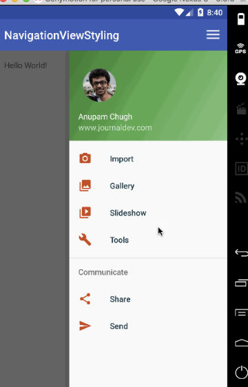
The output of the application in action is given below.
This brings an end to android NavigationView tutorial.